Mentimeter
2021 — Current
Mentimeter is an interactive presentation software that enhances how hybrid meetings and workshops are conducted in the business sector, as well as how lectures and seminars are held in the education sector. As of 2024, it has engaged approximately 117 million participants through real-time data visualizations, allowing hosts to gain immediate insights and draw conclusions for future use.
During my time, Mentimeter transitioned from being a fragmented and leadership fed product department of overall ~ 30 product people to be somewhat working towards the product operating model with autonomous empowered teams with a good level of craft seniority of overall ~ 120 product people.
My role
As Mentimeter adopted the product operating model with dedicated cross-functional teams, I continued to lead the design for the creation (editor) experience. By 2023, over 13 million presentations had been created using the editor.
My focus is on ensuring ease of use for both free and paid users. We measure success through user retention and by tracking how extensively users explore our features and customize the presentations they create.
Some noteworthy projects
Having led the design for Menti-editor for nearly four years, I’ve been directly involved in almost everything that has been developed, from initial ideation to execution and subsequent iterations. Below are some of the notable projects my team has worked on.
Regular, fast paced A/B tests to declutter the editor surface
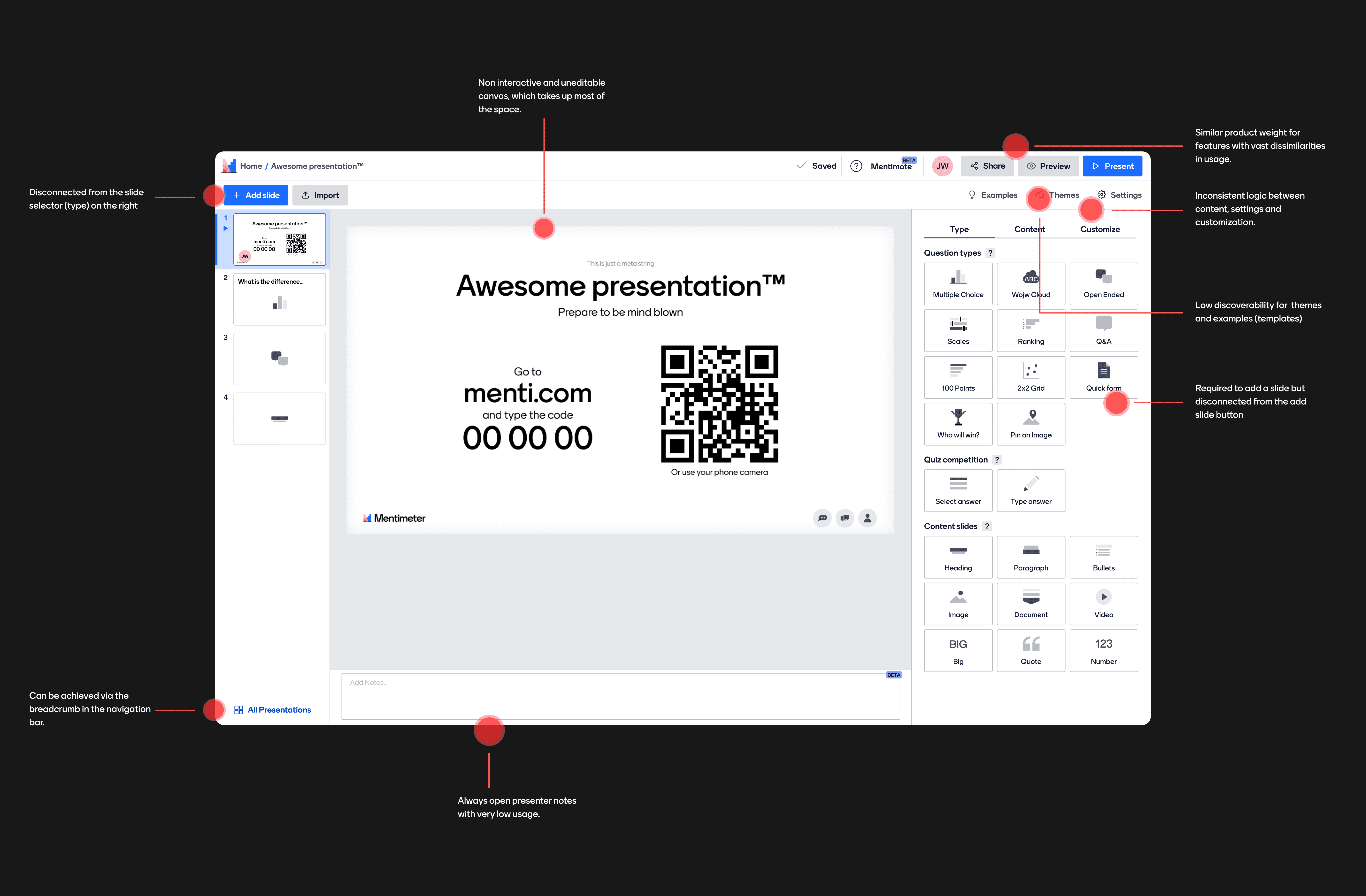
At the start of my team, we quickly noticed that the editor was cluttered with too much information, lacking logical structure validated by any qualitative or quantitative data. We believed that this structure made it difficult for users to find specific actions, with some key functions sharing the same visibility as rarely used features. Given that both product design as a craft and the team itself were still new, a full overhaul of the information architecture seemed too risky and complex.
Dissecting the editor surface (February, 2021)
To address this, we began a series of A/B/C tests on a sprint-to-sprint basis. These tests focused on specific elements of the information architecture, allowing us to make iterative improvements while ensuring no significant drops in the key metrics we prioritized. This approach helped us build confidence in our future design decisions.
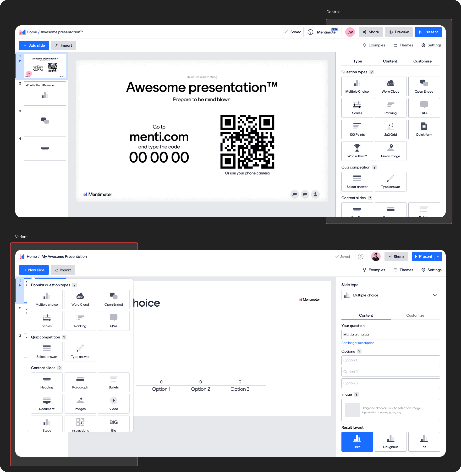
Add slide popover
One of the more ambitious and successful A/B tests we ran was bringing the slide selector (previous on the right) close to the Add slide button (on the left) This significantly simplified the sidebar and removed one out of 3 tabs to be visible only when required.
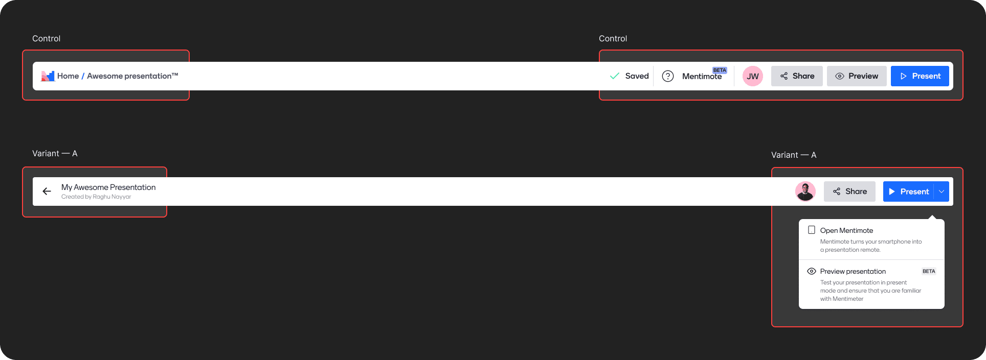
Slimmer navigation
We ran two multi-variant A/B tests significantly slim down the top navigation bar. On the left, we moved away from the breadcrumbs to a back button, and on the right we introduced a more button to emphasize the Present button.
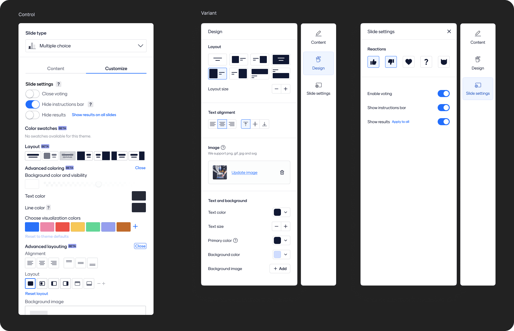
Restructuring the sidebar
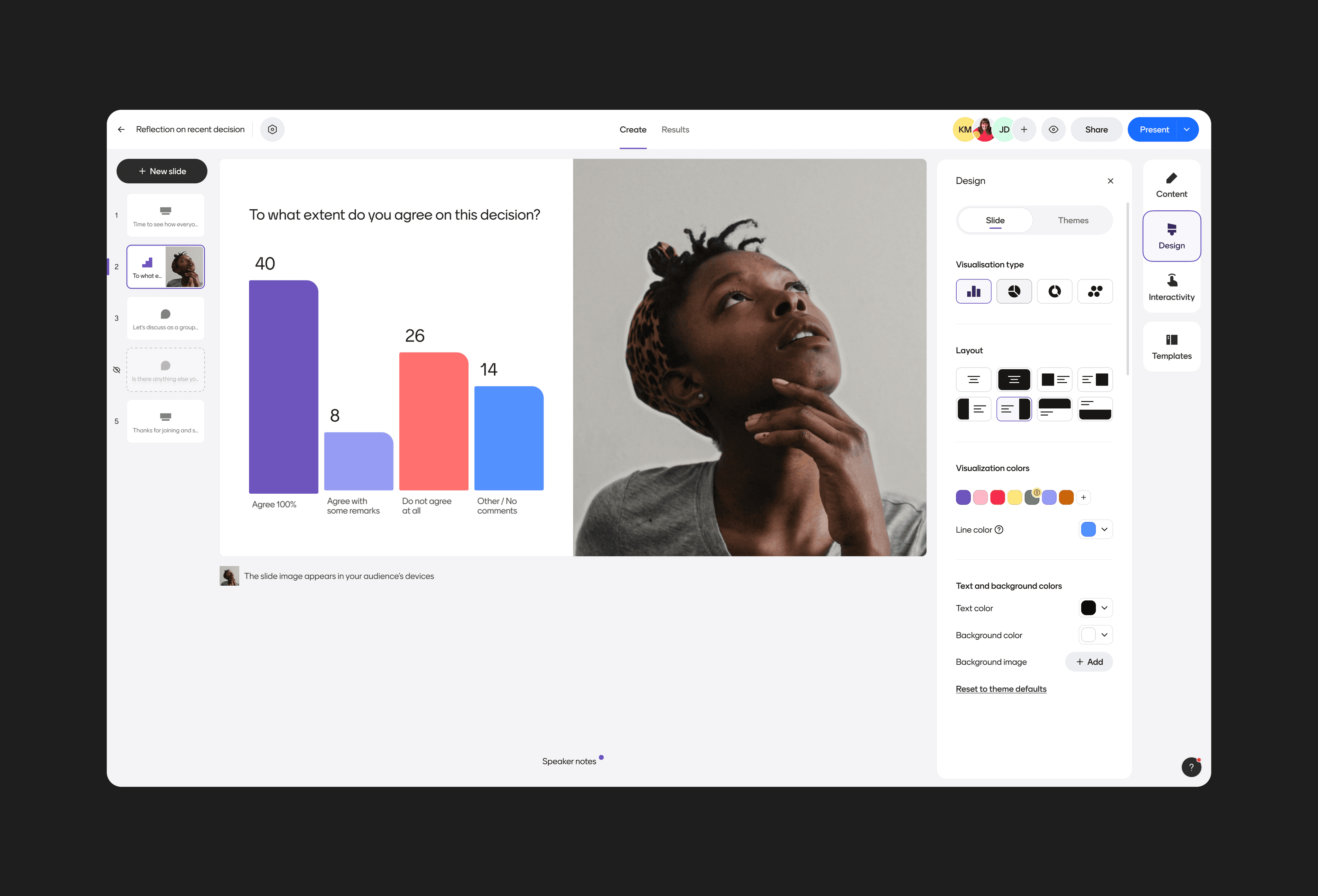
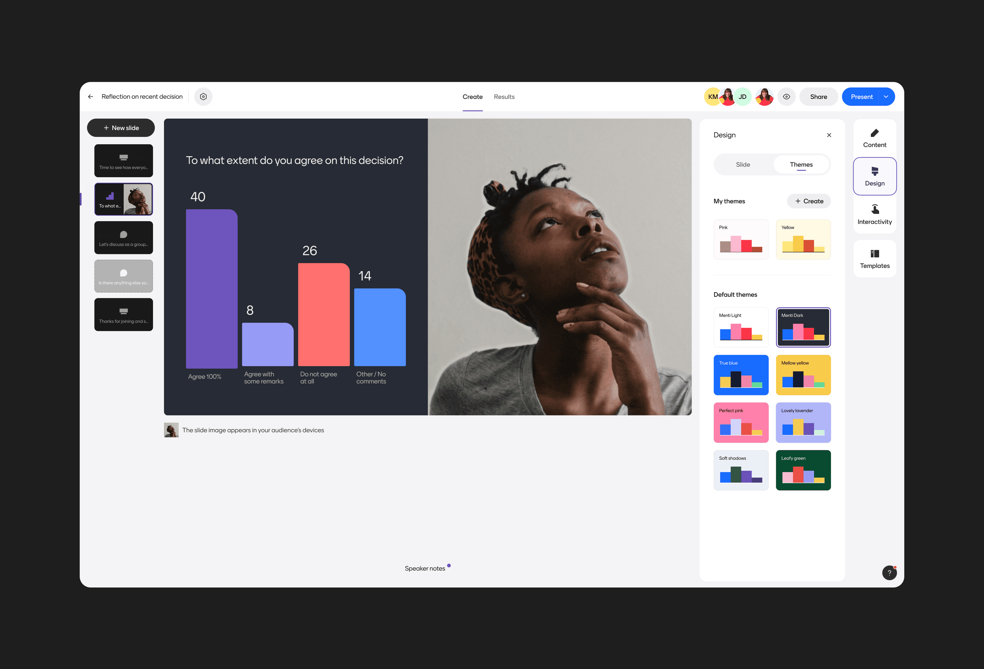
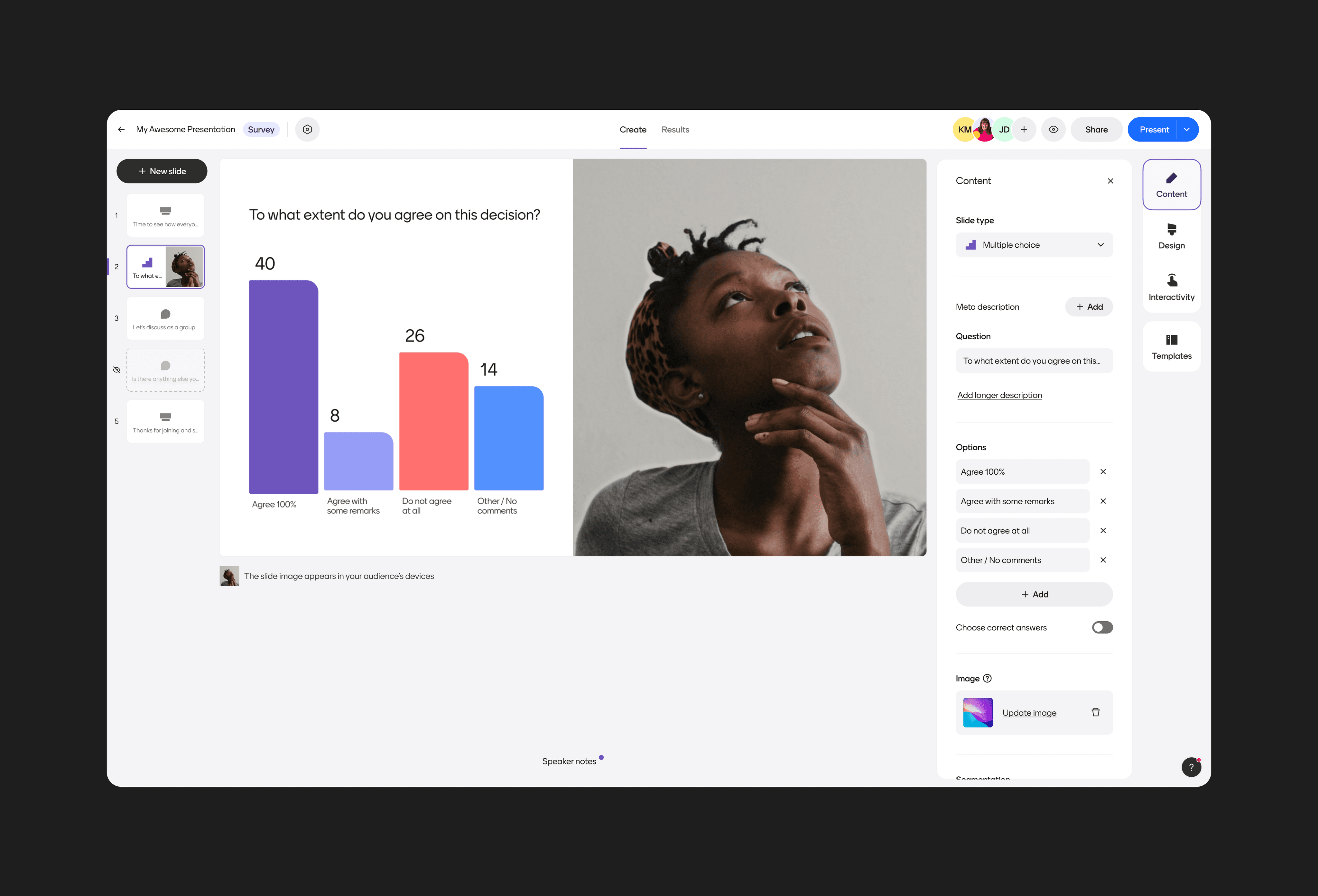
Another one of our ambitious changes included breaking customize into "Design" and "Interactive Settings". We also merged Layouts and Advanced layouts, colors and advanced colors. We took this opportuinity to give a visual facelift to the sidebar.
An updated information architecture
During the autumn and winter 2022 hackathons, I presented two rough drafts outlining how the editor’s information architecture could be completely overhauled, while still respecting our constraints at the time—specifically, the form-based editor (as opposed to the WYSIWYG editor we use today). The concept was well-received internally, but it wasn’t realized until the summer of 2023, when Fabiola Rodriguez, our Design Director and my manager, championed it as a key priority. This required us to make the project bulletproof with extensive market research, concept testing, scoping as well as coming up with a general principle thinking that would help other teams take benefit of the new system.
Portion of the quantitative deep dive used to build the case for prioritizing IA
Market deep dive for editors in different spaces (with Hazel Tan)
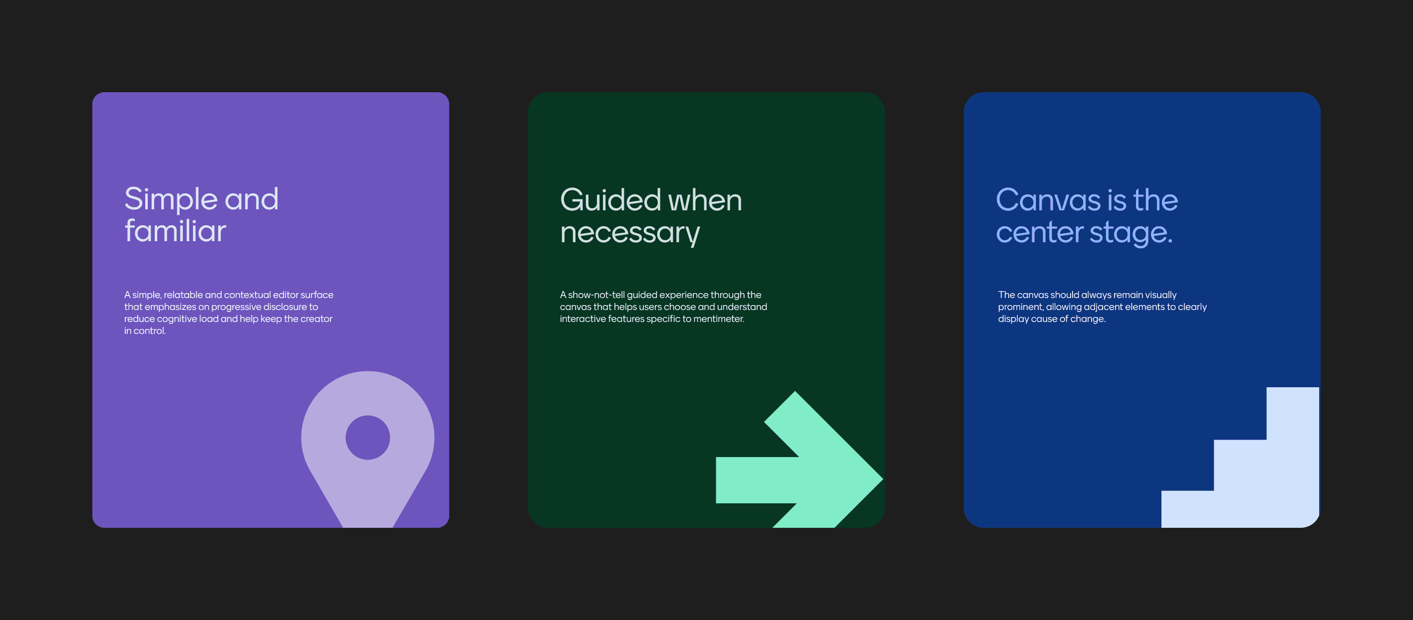
The final design principles that guided us throughout the exploration.
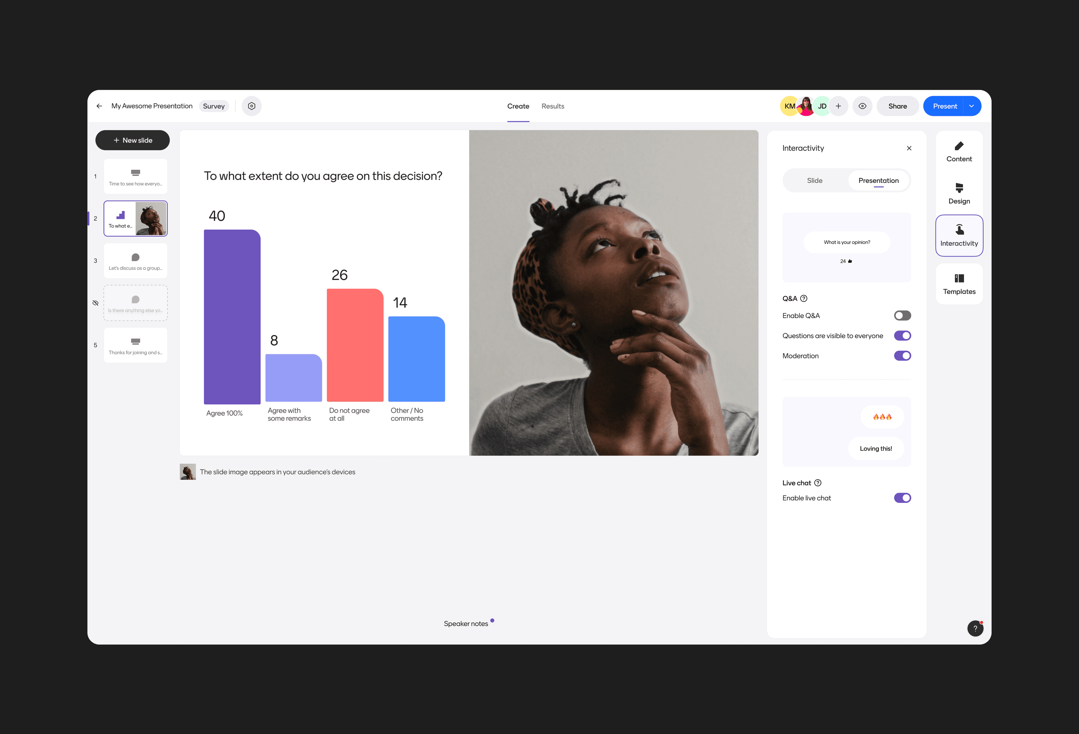
Given the significant nature of the changes, we carefully broke down the change into smaller, manageable milestones that we could roll out gradually rather than opting for a single big-bang release. We went live within the next 6 months with no drop in our retention but a major jump in the usage of themes as well as interactive features like live chat & questions from audience. The editor also looked and felt significantly modern with a parallel project led by the central design team that updated Menti's now-dated visual & brand language.
The IA project laid the foundation of how the Menti editor looks and functions today, and enabled teams to make more rational experience choices. For example, the "Team experience" team could finally build comments in the editor, which would not have been possible in the prior editor surface.
Even with the updated information architecture, all of the editing happened on the sidebar, while the canvas, occupying the majority of the real estate was pretty static and disconnected from the editing. We also had both quant & qual insights on the sheer number of users that click on the canvas to edit the question or the visualization and fail. We handled this with two more initiatives which came out of the IA project organically.
Rich previews
Rich Previews is a classic example of the greatness that happens when a designer and an engineer sit and explore together. At the time, the editor canvas was fairly static and used black and white pngs to show different types of possible visualizations. We wanted to bring it up to life to render what the exact visualizations will look like while a user is exploring the list. The benefit of using real preview was that it could work seamlessly regardless of the theme selected, and we could apply it in different contexts like previewing themes as well as slide thumbnails.
I worked with Alvaro (UI Engineer) who basically got a working prototype done in less than a week and we refined it together for another week. Today, this capability is used across multiple different contexts like the Mentimeter home, dashboard as well as template views.
One of the many use-cases for rich previews was to visualize on hover, how different themes will look like for the current slide in real-time.
In canvas editing
In December 2023, we started exploring how we can leverage the canvas for basic WYSIWYG style editing for questions and visualizations. We had 3 constraints we wanted to respect:
Technical constraint: No bespoke editing for different types of visualizations, given the development and maintenance overhead.
Product constraint: There is no PowerPoint/Google Slides like freedom on the canvas, given that we wanted the users to focus on asking questions and not on getting lost in fine-tuning their slides.
Accessibility: The editing experience needed to be accessible out of the box given it has always been possible for users to create Menti presentations through the keyboard.
We quickly came up with a simple contextual sidebar that reflected the state of the current active element on the canvas. There were a total of 3 levels:
The question level: Advanced settings for the question which was editable directly on the canvas.
The visualization level: Edit the visualizations, irrespective of the type.
The slide level: Edit layouts and slide level design settings.
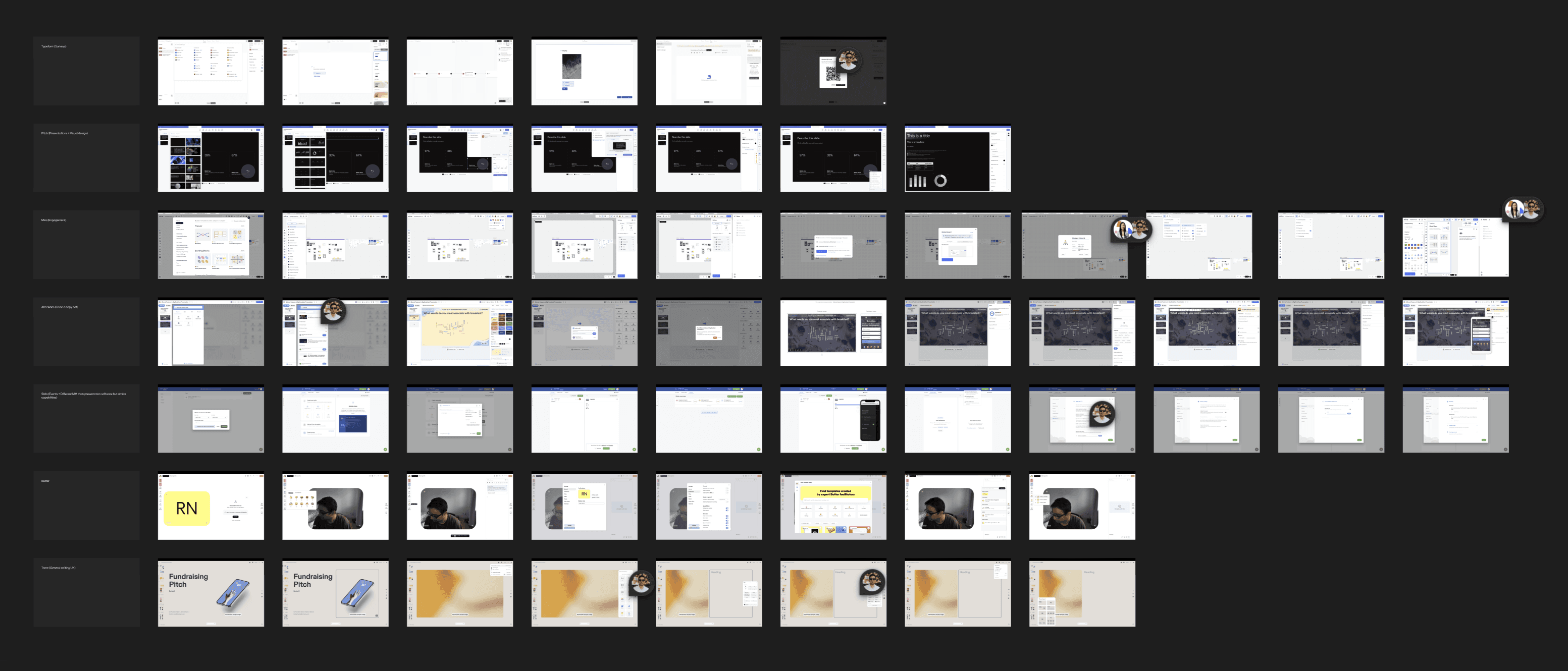
Design Discovery (Problem space) zoom out for Interactive canvas with the core design team.
The 3 selection layers
The sidebar is contextual to currently active element on the canvas.
Organizing information this way helped us merge the content, design, and interactivity into one single tab "Edit". This is a very relatable design pattern to tool like Figma, Framer and even Keynote, in which user's current selection dictates what they see on the sidebar. We wanted to explore if this pattern was relatable with the users, who have historically relied on the sidebar to edit a Menti.
Within a week's time, we had an extensive Figma prototype ready that Max Western (UX Research lead) could test on both new and experienced users. Even though it was extremely tricky to get genuine reactions due to Figma limitations, we learned enough to iterate and move forward. During this time, engineers were already exploring the underlying technology to build this. So, all in all, it all came together nicely.
It took us a month to explore the underlying tech and another month to migrate one slide (multiple choice) to the new editing pattern which we got to test on users. While new users understood the new style of editing very fast, our existing users required some time to understand the change.
Since the majority of work was tech heavy, I got to work on micro-interactions of context switching via keyboard or mouse, directly with the engineers. The result of this collaboration yielded support for text colors and sizes as well as keyboard shortcuts.
It took us 6 months to enable most of our slides to respect in canvas editing and we started rolling the change incrementally to our users to measure impact.
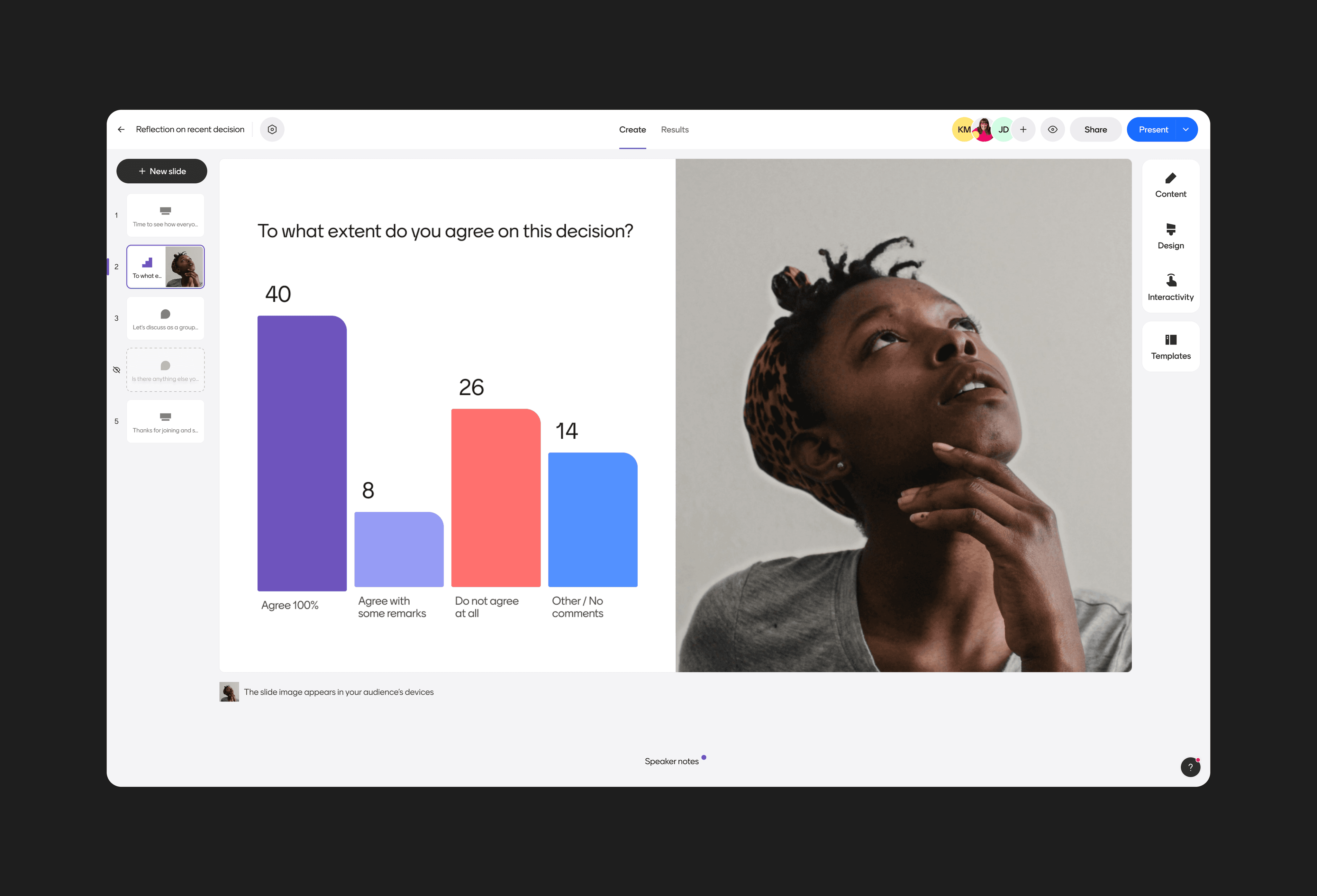
In canvas editing with contextual sidebar, a new toolbar with markdown support.
The initiative was a hit amongst new users with a significant increase in customization of slides, lower time to creation, more questions created , and increased usage of themes as well as our core interactive features. Although, we had to make quick iterations to help users understand the intermediate state through this transition period.
Accessibility checker
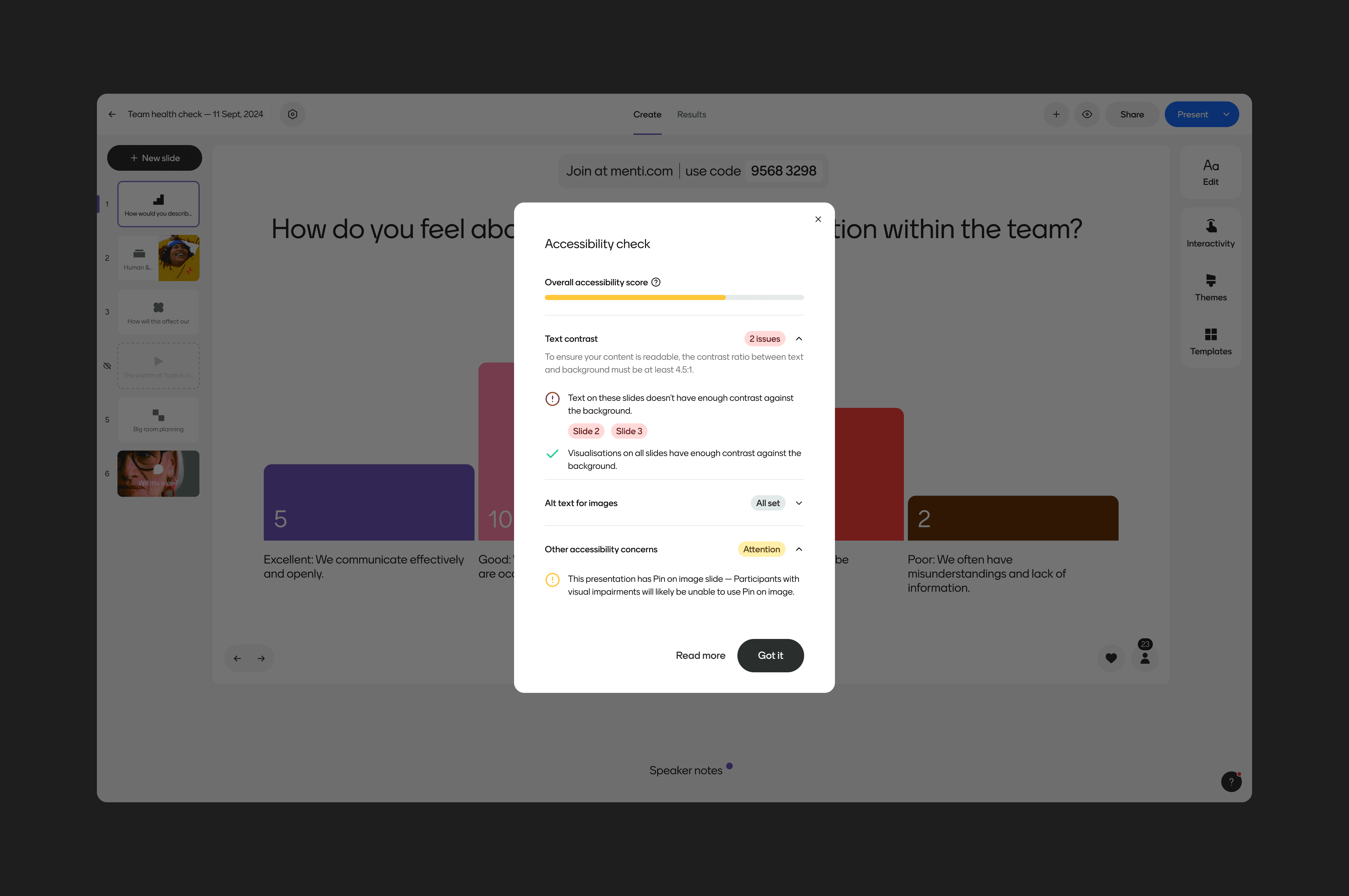
Jonas Flemisch (UI Engineer) and I developed the accessibility checker during the 2023 spring hackathon. The goal of the checker was to ensure Mentimeter presentations met basic WCAG 2.0 standards, particularly around alt tags for images and color contrast between text and images. Additionally, it provided users with guidance on how to correct any issues if they weren’t sure how to fix them.
The checker quickly became a success, particularly in the higher education space, where universities often uphold strict accessibility standards.
Accessibility checker in action
Culture
As the long standing lead for the editor with quite a handful of changes, my product trio (Senior PM: Joakim Rennerfelt, Senior EM: Filip Stenbeck) drove the team from somewhat functional and output oriented to highly outcome oriented that works with fixed time and flexible scope. Our process has been wonderfully iterative with weekly milestones and technical leadership being a shared responsibility, for the most part.
While I lead the overarching design direction and solution discovery, I try to keep things lean and open to change as my engineers get into the details. This allows me to play with my strengths of collaborating with engineers, while the engineers feel both creative and responsible of the overall experience. It also helps us not have the traditional "designer does the design and hands off to engineers" culture in favor of quality being a function of fast paced iterations over an extended period of time.
Credits
My current team
Joakim Rennerfelt, Filip Stenback, Robert Korsgaard, Jonas Flemisch, Álvaro Quílez Borrachero, Rithreaksa Khourn and Daniela Attalla
Team alumni
Erik Johansson, Mireia Bru Martinez, Solmaz Khosravi, Stephanie Flodman, Emma Bäckström, Johan Magnusson, Fredrik Westmark, Petra Renström
Product Design
Viktor Losciale, Hazel Tan, Max Western, Petter Säfwenberg, Kyle Markell, Tiago Almeida
Mentorship
Fabiola Rodriguez, Petri Määttä, Christoffer Kittel
